
By Bob Kaplan
CANCER MORTALITY DOWNPLAYED AND MISUNDERSTOOD BY MEDIA AND INVESTIGATORS
In 2023, an estimated 1,670 people in the US will die from cancer per day. By 2030, the CDC predicts that cancer will overtake heart disease as the leading cause of death, killing 640,000 people each year.
To put this in perspective, on September 11, 2001, 19 militants hijacked four airplanes and carried out suicide attacks against targets in the US, including the World Trade Center in NYC, and the Pentagon just outside of Washington, D.C. Almost 3,000 people were killed during the 9/11 terrorist attacks and is the deadliest act of terrorism in world history by a large margin.
In January of 2023, White House Cancer Moonshot Coordinator Dr. Danielle Carnival issued a statement on a new report from the American Cancer Society on cancer mortality: “The report showing the U.S. has cut cancer deaths by one-third over the last 30 years is great progress,” Carnival states. This finding was widely reported by various news outlets and the ACS themselves.
How do you reconcile these two seemingly contradictory statements: (1) cancer kills more people in the US every two days than the number of deaths from the 9/11 attacks, yet (2) cancer deaths have dropped by one-third over the last three decades?
Part of the issue here is that one of these statements is false. Cancer deaths have not dropped by one-third from 1991 to 2020.
Dr. Carnival dropped an important modifier in her statement: cancer death rate. The new report from the ACS states that the “cancer mortality rate” through 2020 has dropped by one-third since its peak in 1991. Cancer deaths and the cancer death rate are two different metrics. A cancer mortality rate takes into account the size of the US population, which has added some 80 million people over the last three decades, growing to a population of 330 million residents. The ACS reports that in 1991 the “cancer death rate” was 215.1 per 100,000 persons compared to 143.8 per 100,000 persons in 2020, representing a 33% relative decline. (From now on I will often drop the “per 100,000 persons,” but it’s implied anytime I refer to the death rate.)
A quick calculation of the “cancer death rate” reported by the ACS for 2020 (143.8) yields about 474,000 deaths in the total population. Yet the same report shows that there were 602,350 cancer deaths in 2020.
What’s causing this discrepancy? The ACS report also dropped an important modifier: age-adjusted cancer death rate. The cancer death rates reported by the ACS are mythical death rates. You read that correctly. They represent something called an age-adjusted death rate (and should always be appropriately labeled as such), which is an index measure that allows for a hypothetical comparison of cancer death rates in a population over time with an age distribution that never changes.
No, cancer deaths have not dropped by 33% since 1991. There were about 85,000 more cancer deaths in 2020 than there were in 1991. Cancer deaths have increased by 16% over the last 30 years.
No, cancer death rates have not dropped by 33% since 1991. In 1991, the cancer death rate was 203 in the US. In 2020, the cancer death rate was 183. The cancer death rate has declined by about 10% since its all-time peak rate in 1991.
Yes, the age-adjusted cancer death rate has dropped by 33% since 1991, but this metric assumes each resident’s age is fixed for eternity.
Reality paints a quite different picture than simply the uplifting messages that the U.S. has cut cancer deaths by one-third over the last 30 years. More than 60 years ago, in 1971, President Richard Nixon signed the National Cancer Act, a $1.6 billion, federally funded “War on Cancer.” Just “one final push” was supposedly needed to eradicate the disease. Since then, about 27 million Americans have died from cancer, 17 million of them dying between 1991 and 2020. Another six to seven million are expected to die from cancer this decade.
So what’s going on? Are we actually winning the war on cancer, as the Daily Mail, and the recent drop in age-adjusted cancer death rates suggest? What exactly is an age-adjusted death rate and why do researchers use them? Should researchers use them? Are there any better ways to measure and report progress?
Why are cancer death rates age-adjusted?
In short, because the population is growing — larger and older — researchers need to account for both the denominator (i.e., the number of people at risk) and distribution — the age composition, also known as the age pyramid — to track trends over time.
The total number of annual cancer deaths in the US tells us the actual burden of disease in the population. It is useful for determining the magnitude of the problem. But we can’t compare the annual number of cancer deaths to determine if we’re making any progress on cancer if the population grows or shrinks in size from year to year. Assuming equal risk, a larger population group will generate more deaths than a smaller group simply due to size. We need to know the total number of people at risk of dying from cancer. In other words, we need to know the cancer death rates.
Our nation’s “war on cancer” started in 1971, when there were about 330,000 deaths per year. Today, we’re looking at closer to 600,000. Is it fair to say that twice as many Americans are dying of cancer annually since the war started? Yes. The annual number of cancer deaths has almost doubled since 1970.
But what about the cancer death rates? Since 1970, the population grew by 125 million Americans. We’ve grown in number by 60%. In 1971, the population at risk (i.e., the entire population) was 205 million. In, 2020 the population was 330 million. Taking this into account, the annual cancer death rate in 2020 is 13% higher than it was in 1970. Is it fair to say that cancer death rates have increased since the war on cancer started? Yes.
But cancer death rates increase with age. In fact, the median age of cancer death in the US is 72, meaning that half of all cancer deaths occur after this age. To put this in perspective, the current life expectancy at birth in the US is 76 years. Figure 1 illustrates the profound differences in the proportion of deaths occurring in different age groups. The point is, because cancer death rates vary by age, the effect of the population’s age distribution must be taken into account.
/*! elementor – v3.18.0 – 20-12-2023 */
.elementor-widget-image{text-align:center}.elementor-widget-image a{display:inline-block}.elementor-widget-image a img[src$=”.svg”]{width:48px}.elementor-widget-image img{vertical-align:middle;display:inline-block}
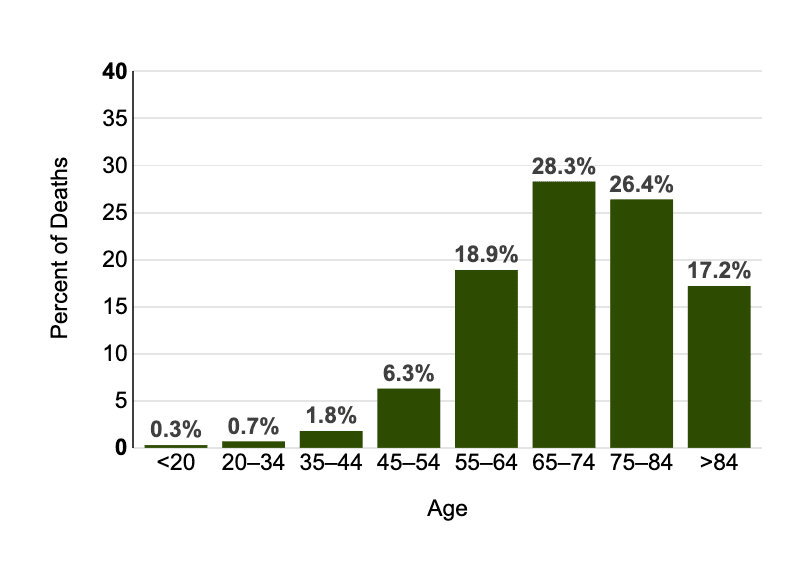
Figure 1: Percent of Deaths by Age Group: Cancer of Any Site, U.S. 2016–2020, All Races, Both Sexes.
[National Cancer Institute]
Since the cancer death rate doesn’t take into account the age distribution of the population, it’s not considered an appropriate measure for comparing differences in cancer death rates between population groups or for assessing change in rates in a population over time.
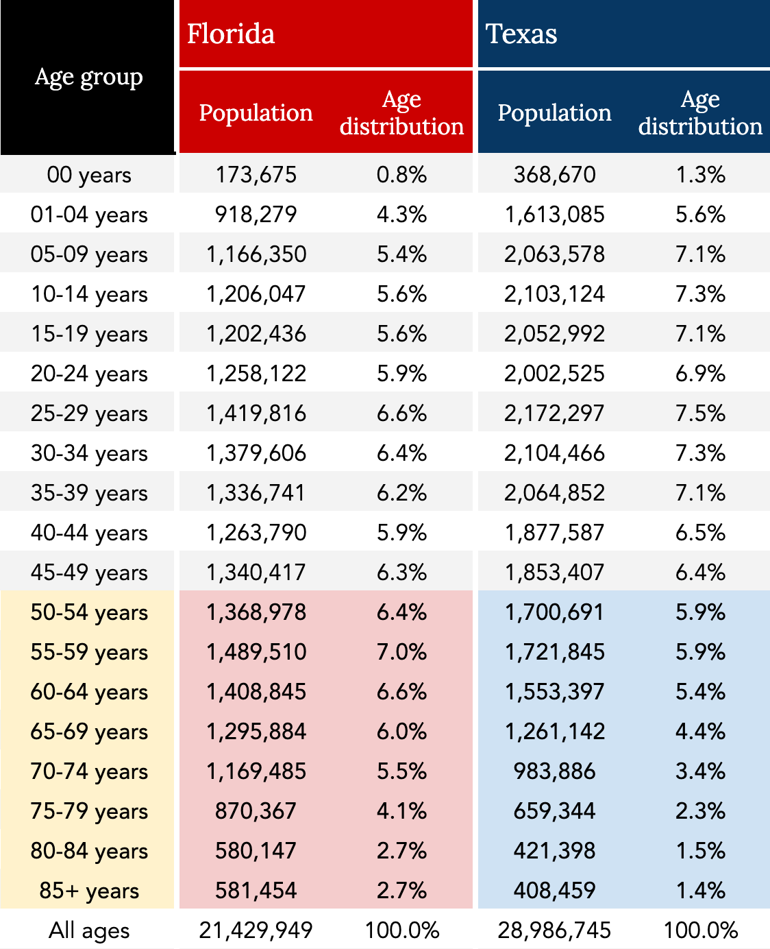
To illustrate the former — the inappropriateness of using death rates when comparing differences in cancer death rates between population groups — let’s look at the difference in cancer death rates in 2019 between Florida and Texas. 1Clifton Leaf uses this example in his book “The Truth in Small Doses.” In about eight pages (pp. 41-49), Leaf explains how age-adjusted death rates work quite clearly (or at least clearer than I did). The entire book is worth the read.
- In 2019, Florida recorded nearly 47,000 cancer deaths in a population of 21 million, a cancer death rate of 218.
- In 2019, Texas recorded about 42,000 cancer deaths in a population of 29 million, a cancer death rate of 147.
- Meanwhile, the cancer death rate for the entire US population in 2019 was 183.
Why did Florida have such a higher death rate — nearly 50% higher — than Texas? Do Floridians live in a toxic environment? Does the Texan lifestyle reduce their risk of dying of cancer? Or does it have more to do with the population distribution differences between the two states? We’ll try to answer that question by applying age-adjusted death rates.
What is an age-adjusted death rate?
So, what is an age-adjusted cancer death rate?
You’re not going to get much help in the ACS report itself if you’re looking for the definition. You only find in the footnotes that “rates are age-adjusted to the 2000 US standard population.” As for an explanation? “The methods for abstraction and age adjustment of historic mortality data are described elsewhere,” the investigators explain, providing a couple of references, and sending the reader on a fishing expedition.
The age-adjusted death rate is defined as the death rate that would occur if the observed age-specific death rates were present in a population with an age distribution equal to that of a standard population. A standard population is a fictional population that serves as a universal template for comparing populations. The standard population currently used by researchers reflects the population distribution as it was in the US in 2000.
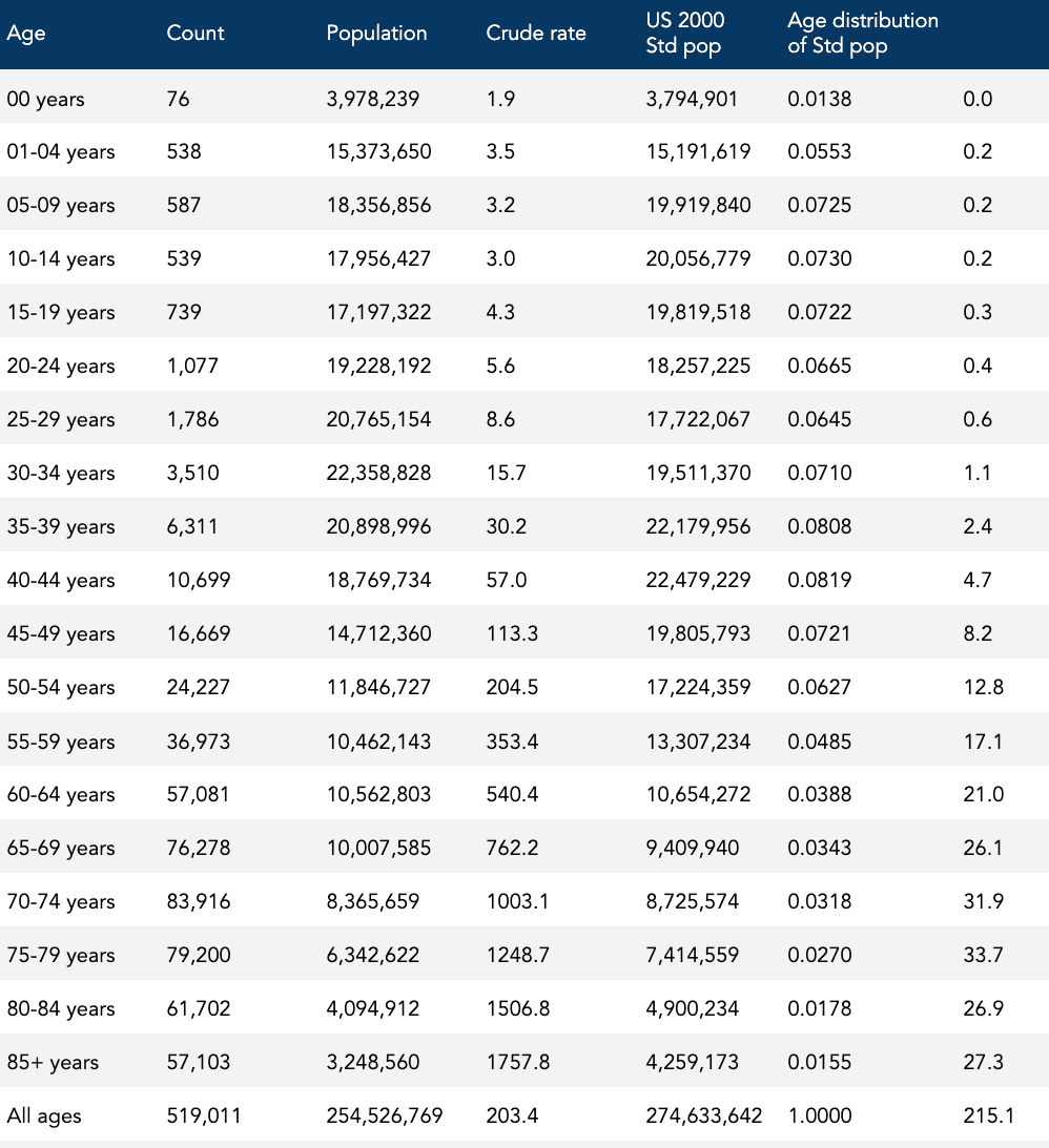
To calculate an age-adjusted cancer death rate, a researcher first has to measure the observed cancer death rates for every age group in the region. Researchers include 19 age groups in this calculation. Using our Florida vs Texas example, let’s look at Florida’s age-specific cancer death rates in 2019, shown in Table 1.
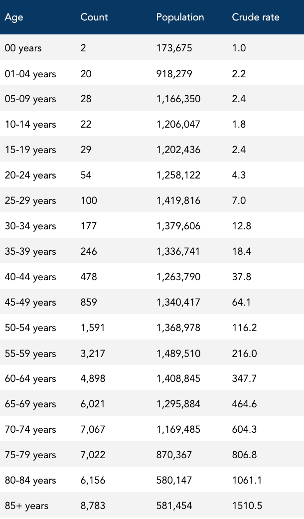
Each of these 19 age-specific cancer death rates is then “adjusted” by a percentage factor that reflects the group’s fixed share in the 2000 standard population. Adding up the lot results in an overall age-adjusted cancer death rate for that area, as shown in Table 1.
For instance, look at the age group: 70-74 years. The cancer death rate, 604.3, is multiplied by the “Age distribution of Std pop” decimal, 0.0318, yielding the product, 19.2: 70-74 years: 604.3 x 0.0318 = 19.2.
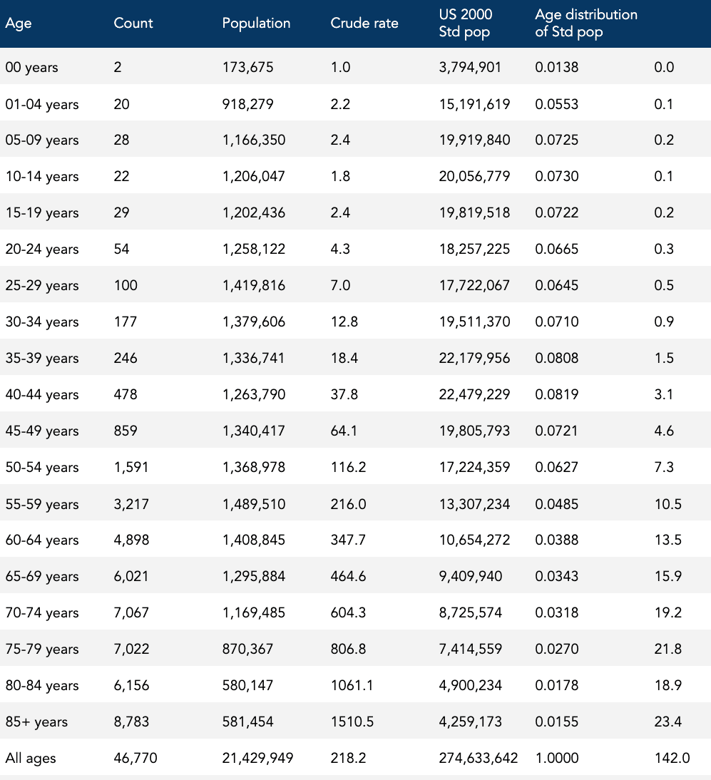
The sum of all the products on the far-right column of Table 2 is 142.0, the age-adjusted death rate.
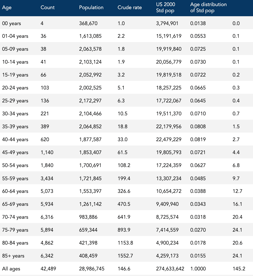
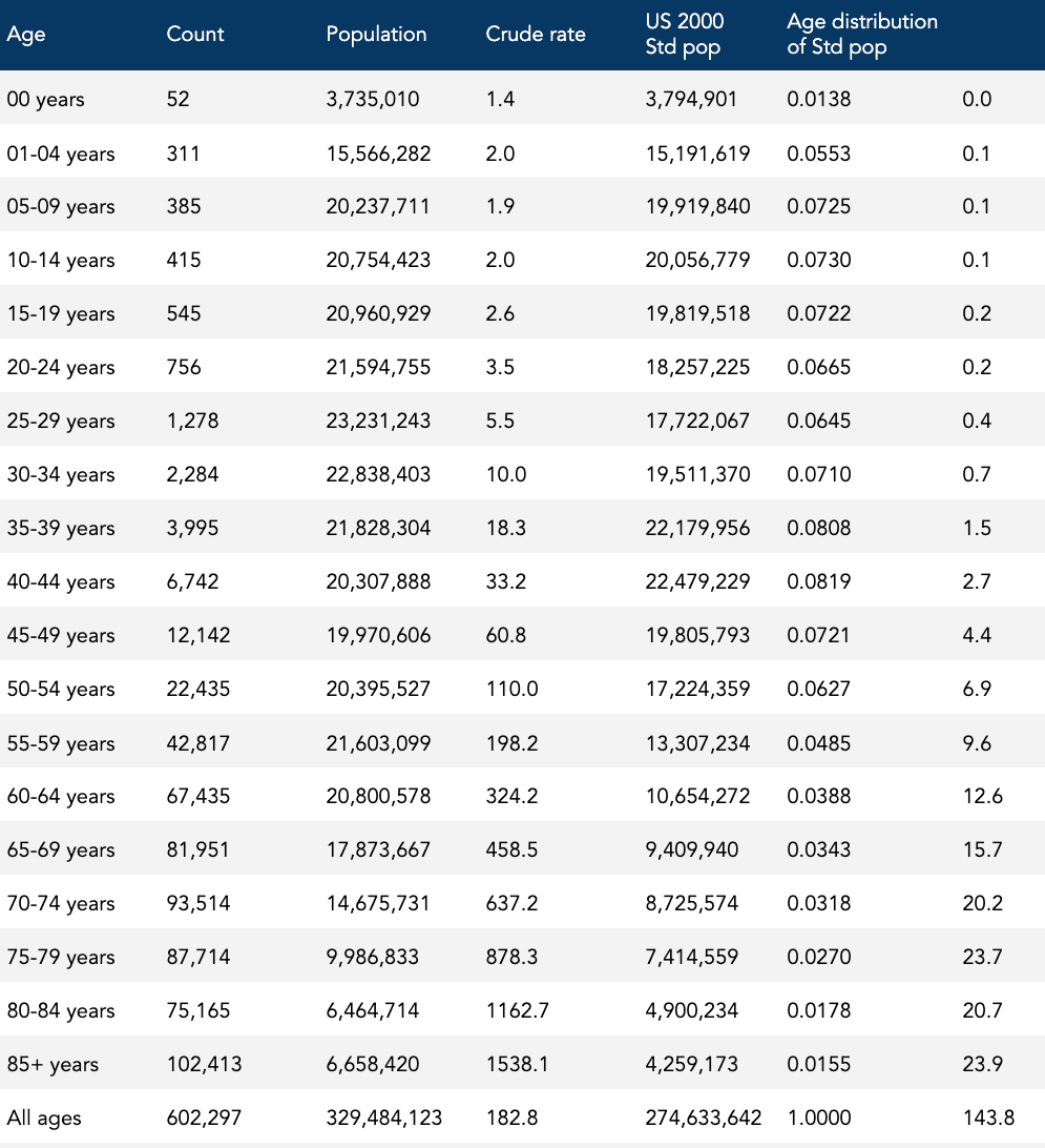
This age-adjusted cancer death rate is now ready to be compared with another age-adjusted cancer death rate — in this case, Texas in 2019 — which goes through the same process, and now both age-specific cancer death rates for Florida and Texas are aligned to the same population age distribution. When we do the calculation, the age-adjusted cancer death rate for Texas is 145.2, as shown in Table 3.
Recall that Floridians had a 50% higher cancer death rate than Texans: 218 compared to 147. It turns out, and this may not be a surprise to anyone, that Florida has a greater proportion of older individuals than Texas. For instance, more than 21% of Floridians are 65 and older, compared to 13% for Texas, as shown in Table 4. Because cancer death rates increase with age, the older Floridian population tends to have higher cancer death rates compared to the younger Texan population.
By calculating the age-adjusted cancer death rate, we pretend that both states have an equal proportion of residents at each specific age. What are the cancer death rates that would occur in Florida and Texas if the age distribution in both populations were exactly the same?
Texans had a slightly higher age-adjusted cancer death rate than Floridians: 145 compared to 142, demonstrating how powerful the effect of age can be, and why using crude death rates may not be appropriate for comparing differences in cancer death rates between population groups.
By using the age-adjusted cancer death rate, investigators can compare cancer death rates among different populations (e.g., Florida and Texas, Japan and Sweden) at the same time by matching for age. Doing these kinds of hypothetical comparisons can be useful for finding differences or similarities in risk that would otherwise be obscured by age. Our Florida versus Texas analysis shows how we can compare age-adjusted rates among different populations at the same time. This method is also used for comparing the same population over different times.
What are the cancer death rates in the US that would occur in 2020, and 1991, if the age distribution in both populations were exactly the same (i.e., exactly the same as the age distribution was in 2000)? That’s the question the ACS is answering when reporting a 33% drop in the age-adjusted cancer death rate. Tables 5 and 6 show the age-specific death rates and the reported age-adjusted rate for 1991 (215.1) and 2020 (143.8), respectively.
Is the age-adjusted death rate misleading?
When the investigators, news outlets, and public health authorities tell us that cancer deaths or the cancer mortality rate have dropped by a third in the past three decades, how many of the millions of people who received this information are aware that this decrease was arrived at by comparing two fictitious cancer mortality rates?
“Researchers can calculate or use software to adjust cancer death rates for age,” explains an article from the ACS, Understanding Death Rates, “which they need to compare groups of people and track the rates over time.” The article provides the rationale for using age-adjusted cancer death rates: the population is growing and getting older. “That’s why even though the number of cancer deaths keeps increasing, the cancer death rate has been decreasing since 1991. For instance, the number of cancer deaths in the US increased from 514,684 in 1991 to 598,038 in 2016,” the article notes. “Yet the cancer death rate decreased 27% from 1991 (215 per 100,000 people) to 2016 (156 per 100,000 people).” These trends are then shown in a chart, reproduced in Figure 2, below.
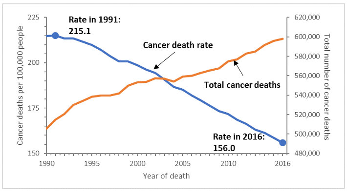
Figure 2: Cancer death rates versus counts for all cancer types combined, United States, 1990-2016 [American Cancer Society]
How many people are aware that those absolute values, 215.1 and 156 cancer deaths per 100,000 people, are mythical values?
To add another misleading example, PBS reported that President Joe Biden is aiming to cut the cancer death rate in half over the next 25 years as part of the Cancer Moonshot, “which the administration believes is possible because the age-adjusted death rate has already fallen by roughly 25 percent over the past two decades. The cancer death rate is currently [as of 2019] 146 per 100,000 people, compared with nearly 200 in 2000.” Again, how many people are aware the current cancer death rate of 146 per 100,000 people cited does not represent the actual cancer mortality risk of the US in 2019? (The cancer death rate was 183 in 2019.)
The confusion around the concepts of the age-adjusted cancer death rate — and the tendency of investigators to conflate the age-adjusted cancer death rate with the true burden of disease — is so common that the CDC’s National Center for Health Statistics (NHCS) has published warnings about it. “It is very important to realize that the age-adjusted cancer death rate is an artificial measure whose absolute value has no intrinsic meaning,” cautions one report. “The age-adjusted cancer death rate is useful for comparison purposes only, not to measure absolute magnitude.” Another CDC report, this one from the National Vital Statistics System (NVSS), warns, “The average risk of mortality of a real population is represented by the crude death rate. The numerical value of an age-adjusted death rate depends on the standard used and, therefore, is not meaningful by itself.”
Recall that the standard the ACS and others use is a carbon copy of the 2000 age pyramid. Also, recall that the ACS investigators are reaching back to 1990-91 as the reference year to claim a 33% drop in cancer mortality.
The country has grown considerably larger and older since 1990, adding 80 million residents, with the nation’s median age increasing by more than five years, to 38.2. Furthermore, between 2010 and 2020 alone, the number of people over age 55 grew by 27%, which is 20 times larger than the growth rate of the collective population under 55 (1.3%). You can clearly see this trend just by looking at the age pyramid for 2020, shown on the right in Figure 3, and comparing it to 2000 (Figure 3, middle). You can also see that the US population in 2020 barely resembles the 1990 population (Figure 3, left), if at all. 2020 is wider at every age group from age 50 onward, and now looks more like a barrel than a pyramid.
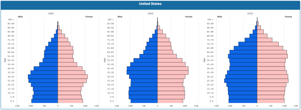
Figure 3: Population pyramids, United States, 1990, 2000, and 2020 [U.S. Census Bureau International Database]
When the population changes like this, the age-adjusted cancer death rate will less-reflect the actual frequency of actual cancer deaths in the actual US population at a given time.
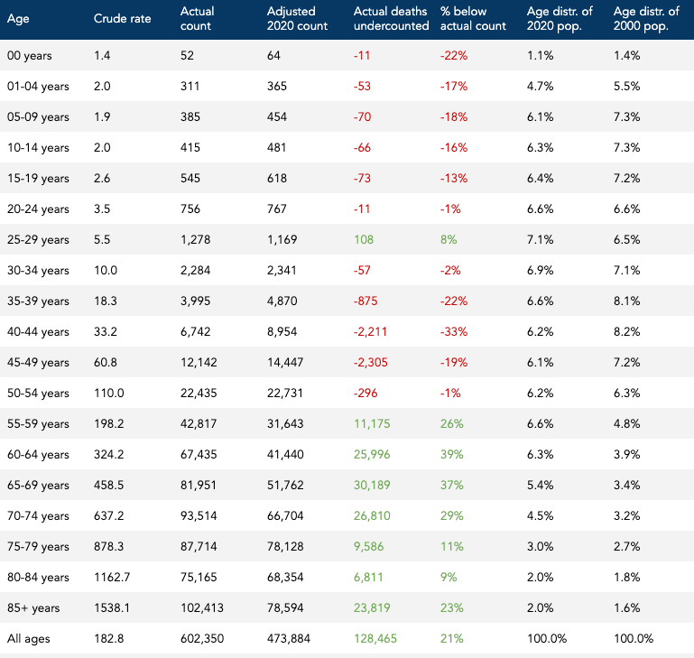
In 2020, the age-adjusted cancer death rate was 144 per 100,000. The 2020 population was roughly 330 million people. We can’t use this age-adjusted cancer death rate to calculate the total number of cancer deaths in 2020 because the age-adjusted cancer death rate is fictional, “whose absolute value has no intrinsic meaning.” But if we blow past that stop sign and calculate anyway, we can see how much the age-adjusted cancer death rate can overcount or undercount the true number of cancer deaths. The total number of deaths using the age-adjusted cancer death rate is about 474,000 deaths. The actual number of cancer deaths in 2020 was more than 602,000. So the age-adjusted cancer death rate in this case undercounts the actual number of cancer deaths by about 128,000, which is 21% below the actual number of cancer deaths, as shown in Table 7.
Why does the age-adjusted cancer death rate undercount the number of actual deaths in 2020? In short, the population distribution in 2020 skews substantially older than the “standard” population in 2000, and the cancer death rate increases with age. For example, in 2020, residents ages 60-64 years of age represented 6.3% of the total population, whereas, in 2000, this same age group represented 3.94% of the total, as shown in Table 7. The age-adjusted cancer death rate pretends it’s still 2000, omits nearly half of the actual population (8 million people) and nearly half of the actual cancer deaths (26,000 deaths) in this age group in the bargain.
When most people hear that the death rates dropped by one-third from 1991 to 2020, they don’t know that the death rates in question had little to do with the actual rates of cancer death in the actual population during those years. When the ACS reports the “cancer death rate” was 215.1 per 100,000 persons compared to 143.8 per 100,000 persons in 2020, most people assume these reported rates are real. But they aren’t.
How should we measure and report progress?
So there are lies, damn lies, and age-adjusted death rates. Age-adjusted death rates can be useful, but they become weapons of mass distortion when they aren’t communicated properly. And virtually nobody seems to be able to do this. So, how can we measure and report progress over time without conflating mythical numbers with real ones?
A big part of the solution is hiding in plain sight.
Individuals want to know what the risk looks like for someone their age and what kind of progress has been made in terms of lowering this risk over time. Public health workers want to know how much progress has been made overall as well as for specific groups of individuals. They also should want to know the absolute magnitude of this devastating public health problem.
Let’s summarize the strengths and limitations of the tools already discussed to see what they can and cannot contribute to individual and public health.
Crude cancer deaths
- Strengths: The total number of annual cancer deaths, or crude deaths in the US tells us the actual burden of disease in the population. It is useful, especially for public health, for determining the magnitude of the problem.
- Limitations: Crude deaths are not an appropriate measure for tracking progress over time in a population that changes in size and/or age and it does not provide the public or the individual with a meaningful measure of risk since it does not include the denominator (i.e., how many people at risk).
Cancer death rates
- Strengths: By including the denominator — the population at risk — cancer death rates can account for differences in population size and provide the public and the individual with a more meaningful measure of risk. Cancer death rates can also be used to hone in on subpopulation groups (e.g., people in a certain age group, sex) and provide the public and the individual with more various and specific measures of risk.
- Limitations: Because cancer death rates don’t take into account the age distribution of the population, and cancer death rates increase with age, it is not an appropriate measure for tracking progress over time in the aggregate population or for comparing different aggregate populations with different age distributions.
Age-adjusted cancer death rates
- Strengths: By taking into account both the denominator (i.e., the number of people at risk) and distribution (i.e., the age composition), age-adjusted cancer death rates are useful for assessing the comparative risk among different populations at the same time or the same population at different times.
- Limitations: Because the numerical value of an age-adjusted cancer death rate depends on a mythical standard population, an age-adjusted cancer death rate is a fictitious measure with no intrinsic meaning. The age standardization may also mask important age-specific information if the age-specific rates being compared do not have a consistent relationship. Age-adjusted cancer death rates can only be used as a summary index for comparison purposes only.
We can see that each measure has important strengths and limitations depending on the context. But here’s the most important existing metric that is hiding in plain sight: age-specific cancer death rates.
Remember that to calculate the age-adjusted cancer death rate, an investigator must first measure the actual cancer death rates for every age group. Researchers include 19 age groups in this calculation, as shown in several of the Tables above (Tables 1, 5, and 6) Each group represents the age-specific death rate, the ratio of the number of deaths in the given age group to the population of that age group, per 100,000 people.
Why doesn’t the ACS simply compare and report death rates over time by comparing the age-specific death rates for all 19 age groups? In fact, the same institutional reports cautioning researchers about age-adjusted death rates also emphasize the importance of conveying age-specific death rates in their recommendations. “Standardization is not a substitute for the examination of age-specific rates,” concludes one report. “[B]ecause age-adjusted death rates are averages,” they represent merely the beginning of an analysis strategy that should proceed to age-specific analyses…,” concludes the other. “In sum, thorough mortality analyses should include examination of age-adjusted rates as well as age-specific rates.”
After all, as individuals, we care more about what our actual risk looks like. Cancer researchers, oncologists, drug makers, and public health officials, alike should also want to know what the age-specific risks are. They can report the current rates and the progress made over time by reporting age-specific cancer death rates, which are actual death rates, as opposed to age-adjusted cancer death rates, which are hypothetical death rates.
Comparing individual age-specific death rates for all age groups of interest is “the most comprehensive and reliable method of comparing death rates over time or between different population groups,” according to one of the institutional reports, and is “the most informative method of making comparisons of mortality risk,” according to the other report.
So, why aren’t age-specific death rates emphasized in reporting? “Although effective in eliminating the effect of age composition,” explains one of the reports, “age-specific comparisons can be cumbersome, because they require a relatively large number of comparisons, one for each age group.” Comparing age-specific death rates “often requires an extremely large number of comparisons and tends to overwhelm both the investigator and the intended audience,” explains the other report. An age-adjusted death rate “is more easily compared than an entire table of age-specific rates. Thus, the age-adjusted rate continues to be an integral part of the analysis of mortality trends and differentials.”
While it may be true that a single age-adjusted death rate is more easily compared than an entire table of age-specific death rates, it is also true that this metric conveys a misleading picture of progress and absolute risk. It should be clear from the various headlines and reporting from the ACS themselves that the age-adjusted death rate is confusing and misunderstood. We shouldn’t sacrifice accuracy in the name of simplicity.
In addition, reporting relative risk values alone is inappropriate and misleading for the individual and the public. You should always know the absolute risk anytime you hear about the risk of any event increasing or decreasing. Because of the way age-adjusted death rates are constructed, they cannot tell you anything factual about the absolute risk of death.
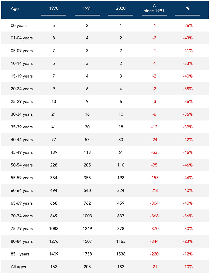
Furthermore, while age-specific death rates include a large number of comparisons, it is not overwhelming to the investigator and the intended audience, as the reports suggest. For example, a comparison of age-specific death cancer death rates between 1970 and 2020 is shown in Table 8. This table clearly shows the absolute rates for each age group and the absolute and relative change in cancer death rates since 1970, a year before our nation’s declaration of war on cancer.
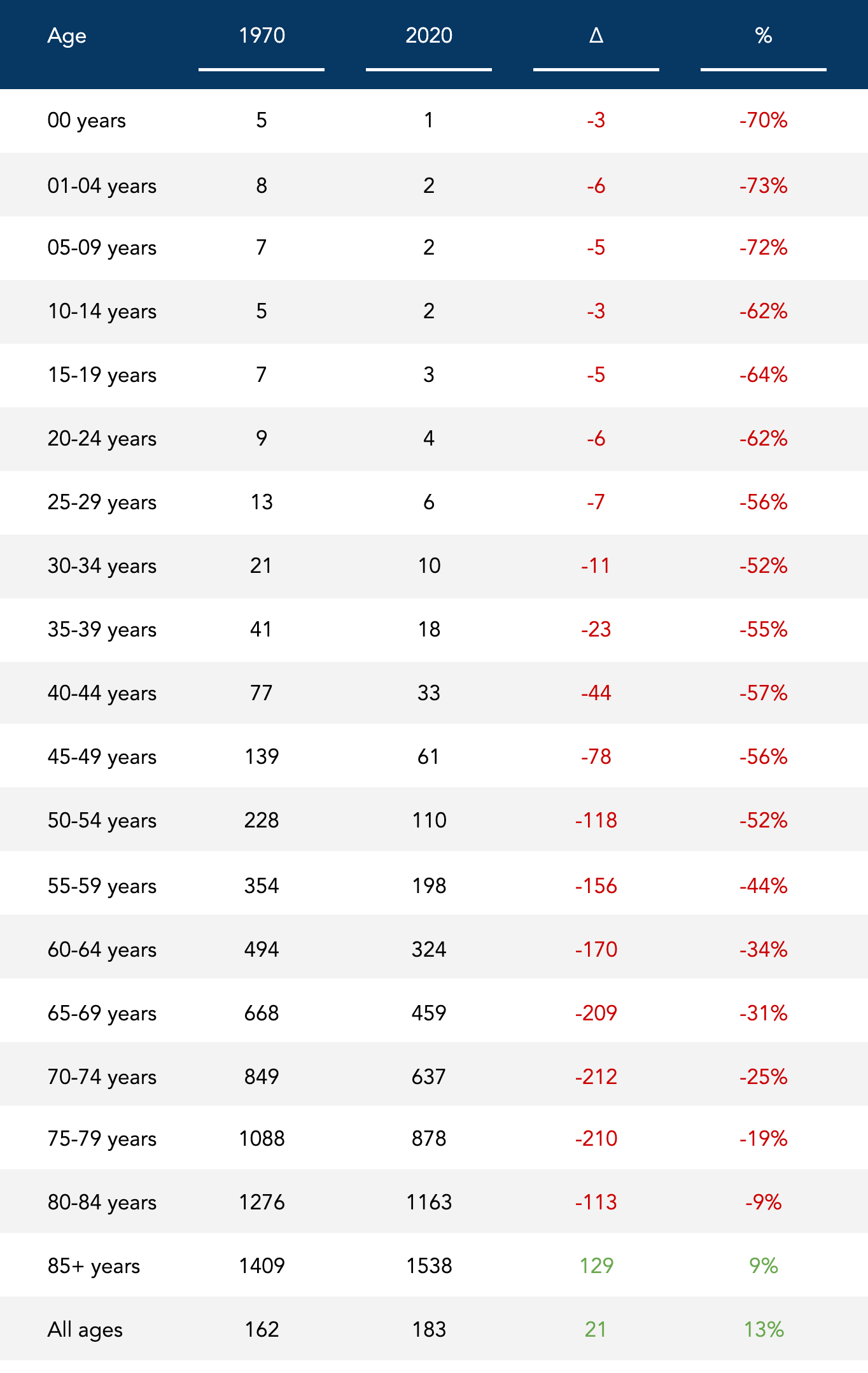
Table 8: Age-specific cancer death rates, 1970 compared to 2020, US.
We can see that age-specific death rates have declined for all age groups since 1970, except for those ages 85 and older. (Since 1991, age-specific death rates have declined for all age groups, including for those ages 85 and older, as shown in Table 8)
This table and information are also far more useful for an individual that wants to assess the average risk for someone their age. If you want to know, for instance, what is the death rate in 2020 in people ages 80-84, you can easily see that it’s 1163 per 100,000 individuals, or 1.2% of this population. You can also compare it to 1970, when the rate was 1276 per 100,000 people, or 1.3% of this population. Now you have a better understanding of both relative and absolute risk trends for this age group. The relative risk in 2020 decreased by 9%, while the absolute risk declined by 0.1%. From a public health perspective, a 9% relative decrease in risk translates to a meaningful decline — a reduction of more than 7,000 cancer deaths — in a group that is comprised of more than six million people. From an individual perspective, a 0.1% absolute decrease in risk translates to a meaningless decline.
While it may seem counterintuitive, both statements can be true at the same time: (1) we are making meaningful progress in reducing cancer death rates in the population, and (2) this progress translates to a meaningless reduction in cancer death risk for the individual. An important caveat is that none of these rates account for individual risk factors or health conditions that play important roles in estimating one’s risk.
If we want to know the absolute burden for each age group and the total population, as well as changes over time, we can look at the actual numbers of age-specific cancer deaths, as shown in Table 9. We can see that the total burden of disease has risen overall, dramatically so for those ages 50 onward, and declined a little in those younger than 50.
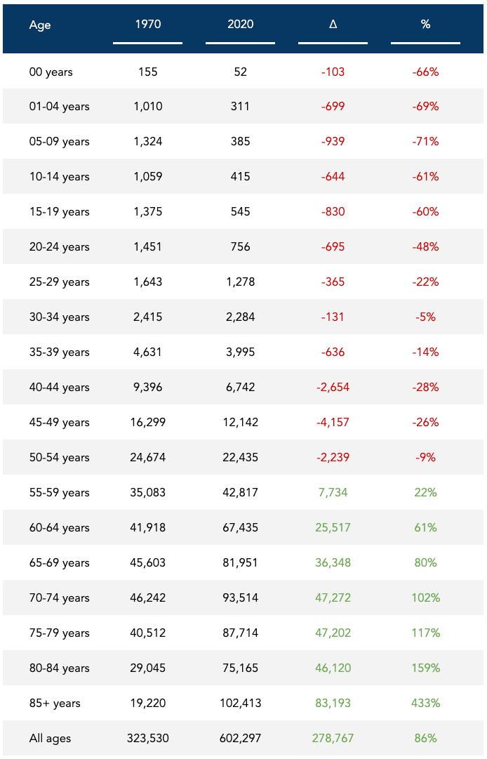
These trends largely reflect a dramatic increase in the population among those ages 50 onward, and relatively little change in those under age 50. Nevertheless, looking at the total number of deaths by specific age groups, and in the population, tells us the actual burden of disease and the magnitude of the problem in the US.
Have cancer deaths dropped?
So, have cancer deaths dropped since 1991? As we now know, we need to be more specific in the question we’re asking. In a nutshell:
- Cancer deaths have increased by 16%: from 518,000 in 1991 to 602,000 cancer deaths in 2020
- Cancer death rates have decreased by 10%: from 203 cancer deaths per 100,000 in 1991 to 183 in 2020
- Age-adjusted cancer death rates have decreased by 33%: from 215 hypothetical cancer deaths per 100,000 in 1991 to 144 in 2020
- Age-specific death rates have declined for all 19 age groups, to varying degrees, as shown in Table 10, while the total number of age-specific deaths has spiked in those 55 and older, as shown in Table 9
There are a couple of important things worth noting. First, from 1970 to 1991 — the first 20 years since our nation’s declaration of war on cancer — overall cancer deaths, the overall cancer death rate, and the age-adjusted cancer death all increased. In fact, the declines in age-adjusted cancer mortality rates since 1991 are preceded by more than 60 years of increases. The year 1991 represents the all-time peak recorded age-adjusted death rate and the second-highest recorded crude death rate in the US (1993 was slightly higher). So using 1991 as the reference population for comparison will present progress in the most favorable light. Second, the decreases in age-specific cancer death rates may be smaller than you think, on an absolute basis.
If we only consider the overall cancer death rates, the 10% decline from 203 per 100,000 in 1991 to 183 in 2020, what does this represent in absolute terms? A 0.02% decline in the annual rate of cancer deaths: from 0.20% in 1991 to 0.18% in 2020. Of course, this doesn’t account for the very different age distributions of these populations. But we know that we can’t use the age-adjusted cancer death rates of 215.1 and 143.8 per 100,000 for an absolute comparison because these rates are purely hypothetical. These rates will change based on the standard population used to calculate them. But if we compare them anyway on an absolute basis, we’re looking at a 0.07% decline in the age-adjusted death rate: from 0.22% in 1991 to 0.14% in 2020.
What we can do with more accuracy is look at the age-specific cancer death rates to see what the progress looks like in absolute terms. Let’s cherry-pick the five age groups from Table 10 with the largest absolute declines from 1991 to 2020, and present them in descending order:
- 75-79 years | 0.37% decline: from 1.25% in 1991 to 0.88% in 2020
- 70-74 years | 0.36% decline: from 1.00% in 1991 to 0.64% in 2020
- 80-84 years | 0.35% decline: from 1.51% in 1991 to 1.16% in 2020
- 65-69 years | 0.30% decline: from 0.76% in 1991 to 0.46% in 2020
- 85+ years | 0.22% decline: from 1.76% in 1991 to 1.54% in 2020
These may seem like remarkably small differences. For example, a little over 1% of people ages 75-79 died from cancer in 1991 compared to a little under 1% in 2020. Should a 75-year-old person consider this progress against cancer mortality for someone their age? Possibly. This individual may not only be worried about what might kill them in a given year, but what might eventually kill them, period. In other words, if we look at the percentage of people aged 75 that will die from cancer in the next 10 years, that 1% needs to be multiplied by at least 10. If we do this, we can see that about 12.5% of people aged 75 died in the next 10 years from cancer in 1991 compared to about 9% that are estimated to die in the next 10 years from cancer in 2020.
So absolute risk can be misleading if we’re not accounting for periods of time longer than a year. But relative risk can be even more misleading if the absolute risk is not presented. Either way, the actual decrease in the cancer death rate from 1991 to 2020 looks like this:
- 10% relative decrease
- 0.02% absolute decrease
The hypothetical decrease using the age-adjusted cancer death rate looks like this:
- 33% relative decrease
- 0.07% absolute decrease
There are a few things we can take away: (1) The age-adjusted death rate is confusing and misleading; (2) The total burden of disease has risen dramatically, much of it due to a rise in the population size and age; and, (3) Age-specific death rates have decreased over time for all age groups since 1991, translating to an absolute reduction in cancer death risk for the individual that is relatively meaningless.
Perhaps the most dangerous thing about claiming a 33% drop in hypothetical cancer mortality rates is the illusion of progress it transmits. It implies we’re on the right path and somehow winning the war on a disease that is projected to be the leading cause of death in the US in the next few years. If you consider the amount of energy, time, and money invested into eradicating cancer, and the fact that we are still beset by an epidemic of cancer, with age-adjusted cancer mortality rates that don’t look much different than the rates in 1930, maybe it’s not exactly time to start thinking about hanging that Mission Accomplished banner just yet.
Nevertheless, while the age-adjusted death rate is misleading and the total burden of disease has risen dramatically over time, the crude and age-specific death rates have declined and represent progress in cancer mortality rates.
No, cancer mortality rates have not actually dropped by a third in the last three decades. But they have declined by a nontrivial amount. The question is: why? That’s the question I’d like to explore next.
Bob Kaplan is an independent research analyst. Bob previously served as director of research at Early Medical, contributing to The Drive podcast with Peter Attia and its other properties. Kaplan was a researcher at the Nutrition Science Initiative (NuSI), and an exercise physiologist at the University of Nevada, Las Vegas. His current and previous research interests include meta-research, chronic diseases, bioenergetics, exercise physiology, and nutrition.

Support the Broken Science Initiative.
Subscribe today →
2 Comments
recent posts

Flawed scientific thinking lies at the heart of postmodern scientific, medical, and institutional failures

Dr. Drew traces the roots of modern misinformation to scientific illiteracy and a growing intolerance for uncertainty, debate, and dissent.

How Broken Science Built the Chronic Disease Epidemic—and Why Education Is the Way Out


Ha! I stumbled across the very same numbers and claims…I am researching for the book I intend to write and cancer is one of the topics. I looked at the statistics and found, amongst other information, the data reported on cancer death RATES by the CDC. Their claims did not makes sense.
I hold am Master in Molecular Medicine although now I am a fitness and health coach (CF Level 3 Trainer). The numbers reminded me of my analytical chemistry lessons. There was clearly some dilution (although delusion would be a fitting term as well) going on. I ran the numbers and drew the same conclusions as you did but started to doubt myself. Sometimes I still trust too much in these authorities. Afterall THEY SHOULD have a firm grasp on statistics, shouldn’t they?
Thank you for confirming my thoughts on the matter!
This delusion…sorry, dilution actually is true for ALL NCDs. WHO claims the rates are decreasing while the total numbers increase. Well, during the past 20 years we have added nearly 2 billion people…that are almost unaffected by NCDs while the remaining population has grown older. Of course that is going to dilute the concentrations and therefore the rates.